
ON FLAGSHIP, LONDON.
Ever wondered what a brand flagship would look like if it was designed by Stanley Kubrick?
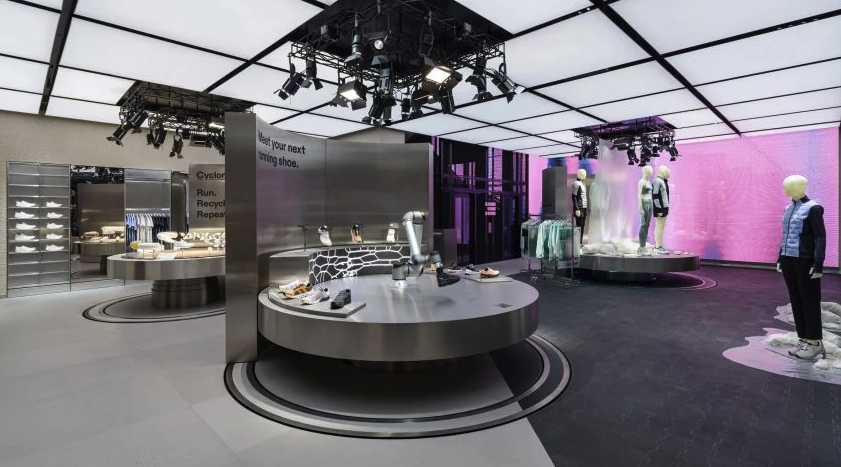
The new On flagship on Regent Street is a small but perfectly formed store, with a mix of materials and finishes that create a pleasingly, clean and futistic aesthetic. The smart use of big screen LED, automation and robotics create engaging stand-out too.
The ground floor engagement space felt fresh and new, with some really nice messaging.
The use of a ‘robotic arm’ to showcase footwear, is a display method we’ve seen a few times in retail in recent years (usually in a window or in a protective box) - but this application worked well, helping to deliver a precision made look and feel, to hero core footwear models.
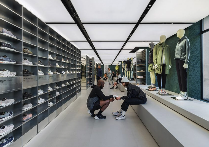
The first floor space, has strong ‘safety deposit-box vibes’, due to the design and finish of the central dividing wall, which helpfully, delineates between footwear and apparel. This is a smart and functional piece of retail design.
Shoe stock was stored behind the footwear wall, and was a smart and practical feature.
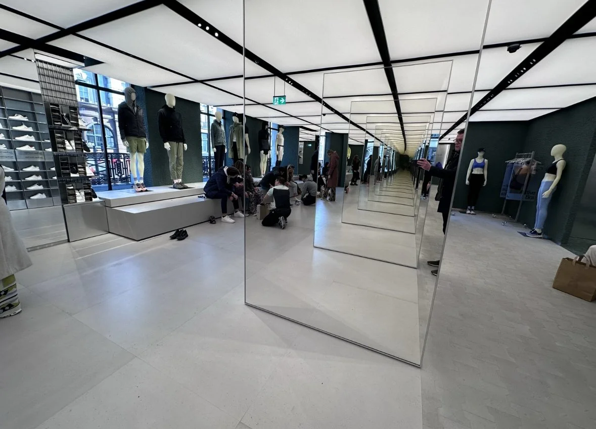
Nice to see an effective use of an infinity mirror illusion in retail, that truly served a purpose - opening up visibility whilst masking the size of a wall, that otherwise would have made the space feel cramped and restrictive.
This is a very effective brand flagship in all areas.
The space elevates brand desire for the ON brand, enhancing its presence in London. The store was busy and vibrant at the time of visit, and staff were personable, chatty and helpful too.
Great store 👍🏻